Better product discovery
5 min read

The Opportunity
Broken navigation blocked 54% of users from basic shopping tasks.
EE UK's site was a £2.8B shopfront, but the nav fought the customer. In testing, everyone flagged Shop as overloaded and poorly grouped; fewer than half of wayfinding tasks ended in the right place. With most telecom sales starting on mobile and rivals offering cleaner paths, the IA was leaking real money.
The Solution
User research simplified EE's nav to three intuitive sections
We ran tree tests and hybrid card sorts with ten people and rebuilt the nav around what they actually looked for: a three-bucket mega-nav (My EE, Shop, Help) instead of the old sprawl. Brands sat together in Shop; "Added benefits" moved to My EE because every participant looked there first; help content landed next to the tasks it supported.
The Impact
New nav ended confusion and increased conversion
After the change, tasks finished more often and people found products faster. Nobody had looked for "Added benefits" under Why EE; everyone expected handset brands under Shop. Odd buckets like "Good As New" and "EE TV" had confused two in five people; those labels got untangled. The point was simple: match the mental model, stop the drop-off.
“Gagan's design approach is grounded in detailed analysis of the users and business needs.”
In the product

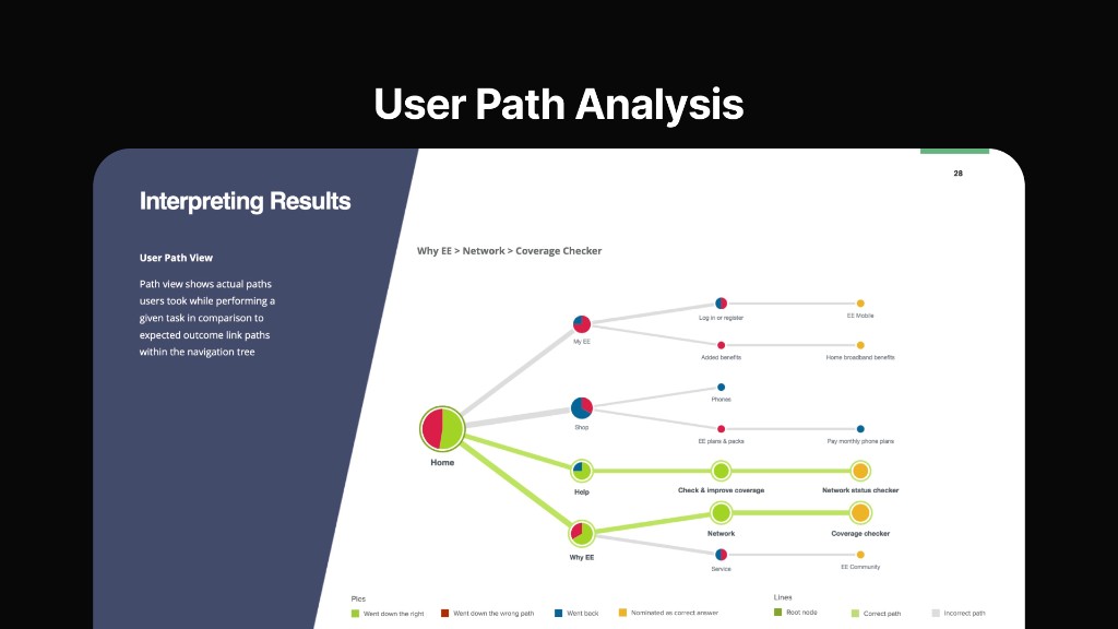
Path view compared actual routes through the tree with expected link paths for tasks such as finding the coverage checker.

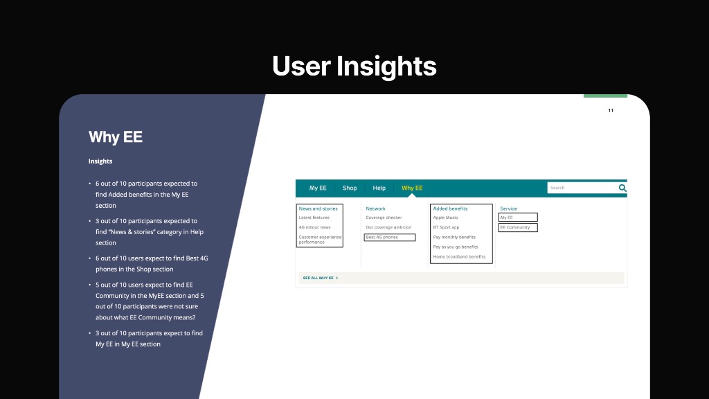
Research-backed notes on where participants expected key tasks, alongside the proposed navigation structure.

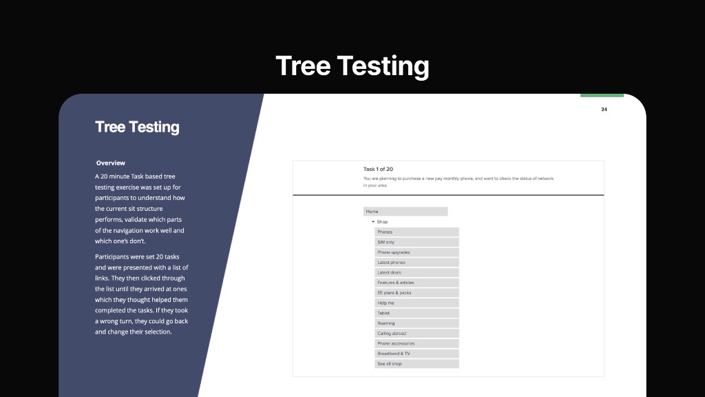
Task-based tree tests let participants click through the IA until they reached a destination that matched their intent.

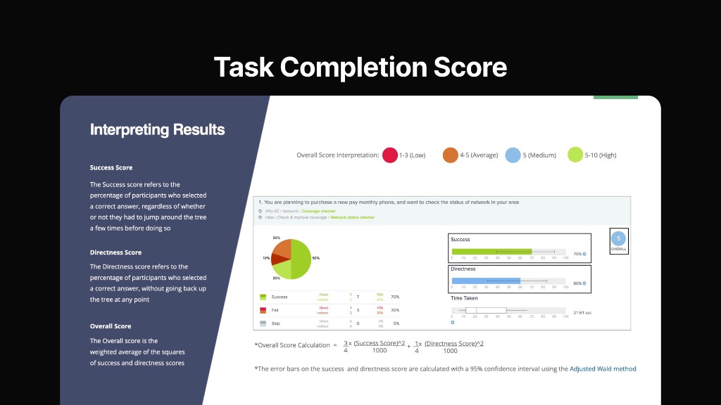
Success and directness scores, with overall score, showed which tasks the structure supported and where it failed.
- Download all images
Media in this story
Related
View all


Ready to take the next step?
Choose the right plan for your team.