Diseño
Ambient Bleed Is Continuity, Not Decoration
By Gagan Malik
8 min de lectura
YouTube already does this on the watch page. Ambient Mode pulls colour from the video into the dark background so the frame bleeds into the chrome. yt-ambient-help yt-ambient-blog
Flat white and flat black article chrome is the CMS era's continuity break. Ambient colour bleeding puts the cover back into the page: a muted wash from the artwork, mixed into the article or card background. That wash is continuity of cover into chrome. An unproofed loud tint that shouts over the sentences is decoration. On gaganmalik.io the wash now lives on Writings article pages and on Writings, Stories, and Videos bento cards. I am not claiming a lab study of comprehension. I am claiming craft that living-room apps already treat as product hygiene, and that longform still abandons the moment the scroll begins.
You Feel Continuity Before You Name the CSS
Most readers will never open DevTools for this.
They will only register that this essay, or this card on the hub, has a temperature. Warmth without syrup. Depth without a sticker fighting the type. The grid stops pretending every title rents the same empty panel with a different poster taped on. Continuity starts when the eye lands on the card, then deepens when the article mounts. That is editorial presence: the cover's colour world stays faintly present while you browse and while you read, which is part of how Sustained Reading Is a Luxury Good treats protected attention as an environment, not a personality trait.
The Living Room Already Solved This
In 2021, Plex documented Modern Layout as an artwork-first frame for titles: a background colour extraction process aimed at immersive browsing, with App/Home Background and Details Background defaulting to Artwork Colors. plex-modern That mode applies colours from the current title's artwork to the background and transitions the colourfield as selection changes. Users who hate the immersion can set Artwork Colors to None, or choose Dimmed Art on detail pages. Plex's own HTPC settings describe Artwork Colors as a gradient using colours from the poster. plex-htpc
Secondary writeups from How-To Geek and 9to5Mac corroborate the morphing background on the Modern UI, including on Apple TV clients. howtogeek-plex 9to5-plex Immersion shipped with an off switch because taste is not universal.
Album Art Taught Restraint
Music apps turned the same idea into a daily habit.
Benjamin Mayo describes Apple Music album and playlist pages adopting a background colour that complements the artwork, while keeping foreground text black or white only. mayo-music He notes the 2015 Music approach extracted two or three colours for background and foreground separately, which looked clever and aged badly when tinted type fought the interface. Spotify album and playlist surfaces widely extract dominant artwork colours into gradients on a dark canvas; design writeups treat artwork extraction as an explicit adaptive-colour pattern. crosley-spotify
Operating Systems Made It Policy
Phones elevated the cousin to system chrome. Material Design 3 makes dynamic colour from a user-generated source such as wallpaper official, with tonal palettes and roles meant to preserve contrast when developers use the system correctly. m3-dynamic android-dynamic A longform cover is the wallpaper of an essay.
Native Apple TV Appearance is Light, Dark, or Automatic by time of day, not poster extraction. apple-tv-appearance What you do get on the living-room box is theatrical bleed: screensaver imagery softens into Home Screen chrome unless Reduce Transparency is on, and Plex's Apple TV client is where Artwork Colors actually ships. Cousins, not clones.
Continuity Starts on the Card Grid
If the wash only appeared after click, the hub would still feel like a CMS shelf.
So the same resolved hex tints Writings, Stories, and Videos bento cards through a scoped custom property on the card itself. Never on the document root. The text panel picks up a soft ambient fill; featured horizontal cards let colour bleed from the image column into the copy. That matters product-wise: the reader meets the temperature on the grid, then recognises it again on the article page. Two scopes, one family of washes. Document-root theatre for the long read. Card-local tint for the browse. Chrome is a product stance here, the same way The GUI Sells Comfort. The CLI Sells Control. treats interface surface as a choice about what the tool is for.
Sample Small, Mute Hard, Store by Slug
Under the hood, we do not stream a live palette engine into production.
An offline script samples cover art for Writings with a cover image, Stories with a card image, and Videos with a thumb (local or remote). It resizes to a forty-eight by forty-eight grid, skips near-black and near-white pixels, weights the rest by saturation, then mutes and darkens toward a near-black cinema wash in a narrow lightness band. Hexes land in a slug map that covers the whole newsroom surface. Slug collisions keep the first colour and warn. Render resolves only when a cover exists: optional curated override first, else the map. Auto-extract is a first draft. Proofreading is the job, because photographic colour is not yet UI colour. pixcode-palette
Set the Room Before Paint. Clear It When You Leave.
Article activation is not a client-only afterthought.
The article page resolves a hex, then a server component validates it and injects a tiny inline script that stamps the document root before first paint so the wash does not flash in late. A client child keeps the same attributes in sync after hydration and clears them on unmount, so navigation does not leave yesterday's maroon on pricing. Sticky nav stays out of the theatre because the wash lives on html as viewport-fixed chrome, not as a scrolling prop. Invalid hexes never mount. Boring on purpose.
Lift the Hue for Daylight. Keep the Tokens for Type.
Cinema-dark tokens are honest for dark mode and treacherous for light.
Mix a near-black ambient straight into a white page at a shy percentage and you get flat grey, not atmosphere. So light mode lifts lightness from the cover hue into a wash colour, then paints a radial top glow over a linear fade into the page background, closer to living-room chrome than to a single stripe. Dark mode keeps the deep tokens and mixes harder. Where relative colour is unavailable, a stronger linear fallback still fades into the background. Body and main go transparent so the html wash shows. Text foreground tokens stay the readability contract. Prefer reduced motion when the reader asked for less. Cards learn the same lightness-lift lesson locally. If the wash is louder than the argument, you shipped decoration, the cargo-cult cousin of what Compact Is Not a Virtue Signal refuses: copying a look without earning the craft.
Stage Gel Is Not the Actor
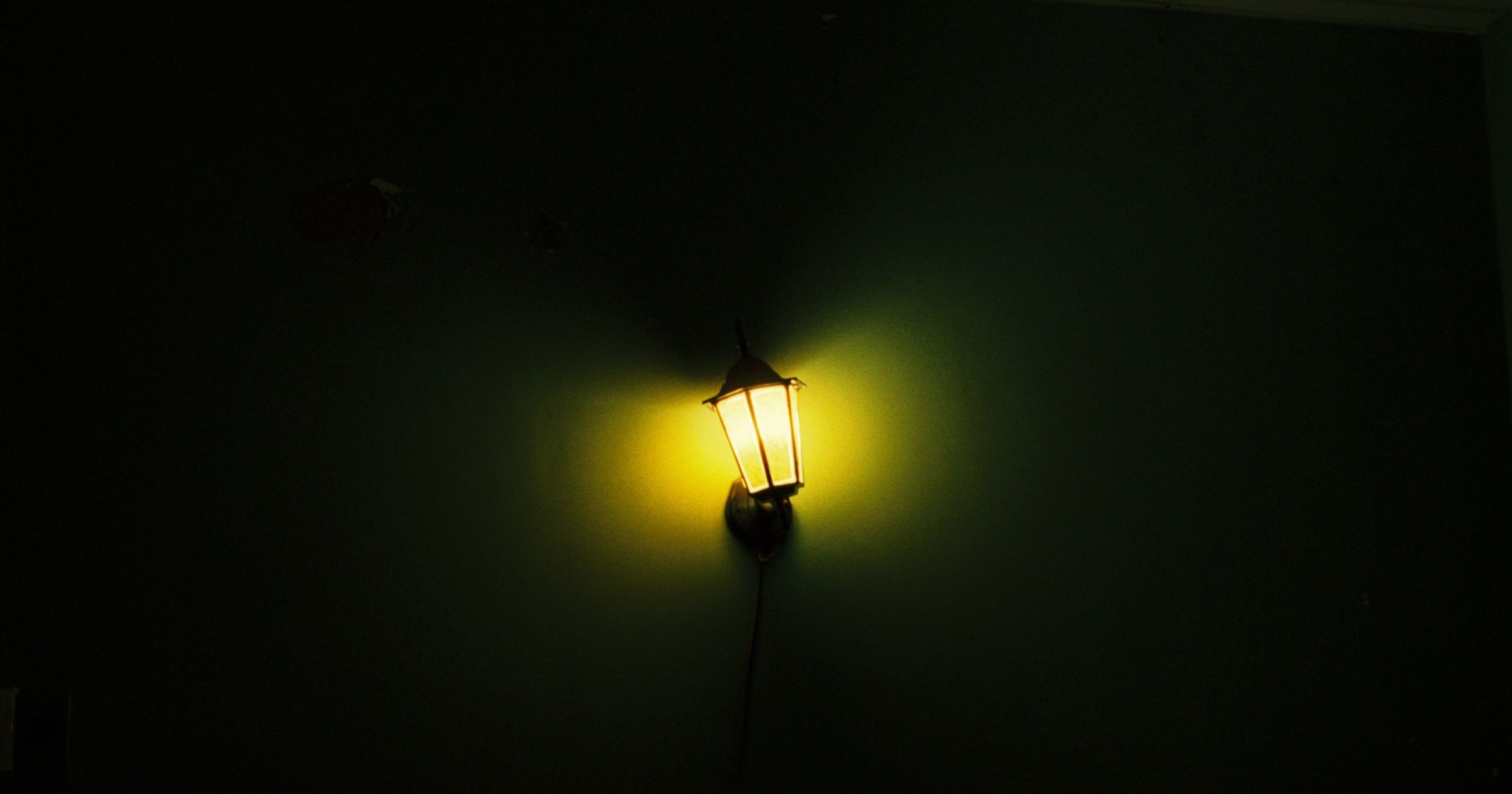
Think of a practical light with a gel on a brick wall.
Nobody came to watch the wall. Without the spill, though, the scene feels cut from a different reel: subject lit, surroundings dead, continuity broken. Ambient bleed is that spill. It is not mood-lighting as a LinkedIn adjective. It is the soft refusal to treat the cover as a thumbnail that expires at the fold, or as a card image that never colours the panel beside it. [TODO: personal detail: first time you noticed light spill on a set, in a screening room, or in a Plex poster wall at night]
Every Essay Looking Like Every Other Essay
The cost of skipping this is not aesthetic failure in a design critique.
It is sameness that trains the eye to skim. If every cover promises a distinct world and every hub card and body dumps you into the same CMS void, the reader learns that art direction was marketing and the article was inventory. The other cost is the opposite mistake: trusting the extractor blindly and shipping a theme theme. I have already opened extracted hexes and rewritten them by hand when a cover lied. That discipline is the human work. Decoration is what you get when you automate the wash and never look again. Flat chrome is still a decision with a maker, the same charge Someone Designed That Button levels at interfaces that pretend nobody chose the harm.
Five Moves That Travel Across Stacks
Keep the order honest even if your framework differs.
Extract offline and mute toward cinema-dark tokens, then store a curated map by slug. Resolve only when cover art exists, and prefer a hand override when the image lies. On the article, set the CSS custom property on the document root before paint and clear it when the reader leaves. On cards, scope the custom property to the card alone so the rest of the page stays clean. In CSS, mix into the background, lift lightness for light themes when tokens are cinema-dark, optionally stack radial glow over linear fade, and proofread light and dark until the argument still wins.
Keep the Theatre Black
A fair objection says ambient bleed is decoration: lipstick on a CMS, taste theatre for designers performing Plex, a flourish that does nothing for the sentence and only pollutes a clean theme.
Hold that. Then notice what careful bleeding actually does. We mute and darken before the page sees the colour. We lift hue for daylight without rewriting text tokens, closer to Apple Music's black-or-white restraint than to 2015's tinted type experiment. mayo-music We clear document-root state on leave and keep card washes scoped. We leave a path to None in product terms even when the default is on. plex-modern Decoration ignores those constraints. Continuity respects them.
Void Cinema Is Still a Choice
Another fair objection says cinema means a void, not a tint: keep the room near-black so posters carry the chroma, the way many Netflix surfaces do. Dynamic theming is also a brand and accessibility tax. Fixed palettes are predictable. Material You only stays accessible when you honour semantic roles; misuse the tokens and contrast collapses. designdroid-my Raw image colours often fail WCAG AA until lightness is adjusted. How-To Geek notes that every Plex UI change sparks backlash, and Modern survived partly because immersion is optional. howtogeek-plex Netflix void and artwork wash are both legitimate theatres. Flat CMS chrome that ignores the cover is neither.
Ambient colour bleeding is continuity from the hub to the scroll, not decoration that shouts over the argument. Flat chrome is how you tell the reader the art was only packaging. The next person who opens your newsroom should feel the temperature change with the story, not discover that every story rents the same empty hall.
¿Trabajamos juntos?
Consulta los planes o haz una pregunta.
Más sobre Diseño
Ver archivo
Mantente al día
Añade este enlace a tu lector RSS para recibir nuevos ensayos y actualizaciones automáticamente.