Diseño
Wada said so.
By Gagan Malik
9 min de lectura
A pocket book of colour pairings, drawn from volumes of the 1930s and first published in Kyoto in July 2010, went into its 88th printing this summer. seigensha-reprint-log In early October its own publisher was taking pre-orders for the next batch. seigensha-shop
The book is A Dictionary of Color Combinations. It holds 348 pairings, gathered by a painter named Sanzo Wada, who died in 1967. seigensha-book hanmoto-first-edition Nobody who recommends it explains why those pairings work. My favourite wrestler, Stone Cold Steve Austin, ended his speeches with "that's the bottom line, 'cause Stone Cold said so". People quote Wada the same way. Wada said so, and that's the bottom line. I wanted a better reason than that.
It isn't nostalgia
The easy explanation is nostalgia, and the Japanese edition invites it. Its subtitle promises colour notes from the Taisho and Showa eras, and the publisher tags it retro modern. seigensha-book Yet the same publisher says the book is popular overseas. seigensha-overseas Nobody in London is homesick for 1930s Kyoto.
I think people rave because the pairings look new. They look new because Wada chose them on an axis the colour wheel ignores. I ran the numbers to check.
What the wheel cannot see
Coolors, a popular palette tool, advertises more than ten million palettes and can generate by colour-theory rules. coolors-home Those rules are angles on a wheel: complementary, triadic, analogous and the rest. I ran them over an open dataset of the book's 159 colours and 348 combinations. wada-open-dataset Of the 335 combinations with a measurable hue, 136 obeyed the rules throughout, or 41 per cent. Random draws from Wada's own colours scored 40 per cent, and the two stayed level at every tolerance I tried.
On hue, then, his choices cannot be told from chance. Light and dark are another matter. His combinations sit further apart in lightness than random ones: an average gap of 27.8 points on a 100-point scale, against 23.3. Part of that is his fondness for black and pale yellow. When the random draws favour the colours he favoured, the gap narrows to 26.3, and only 12 shuffles in 2,000 beat him. Wada was composing in light and dark, and a wheel does not measure that.
The £220 authority
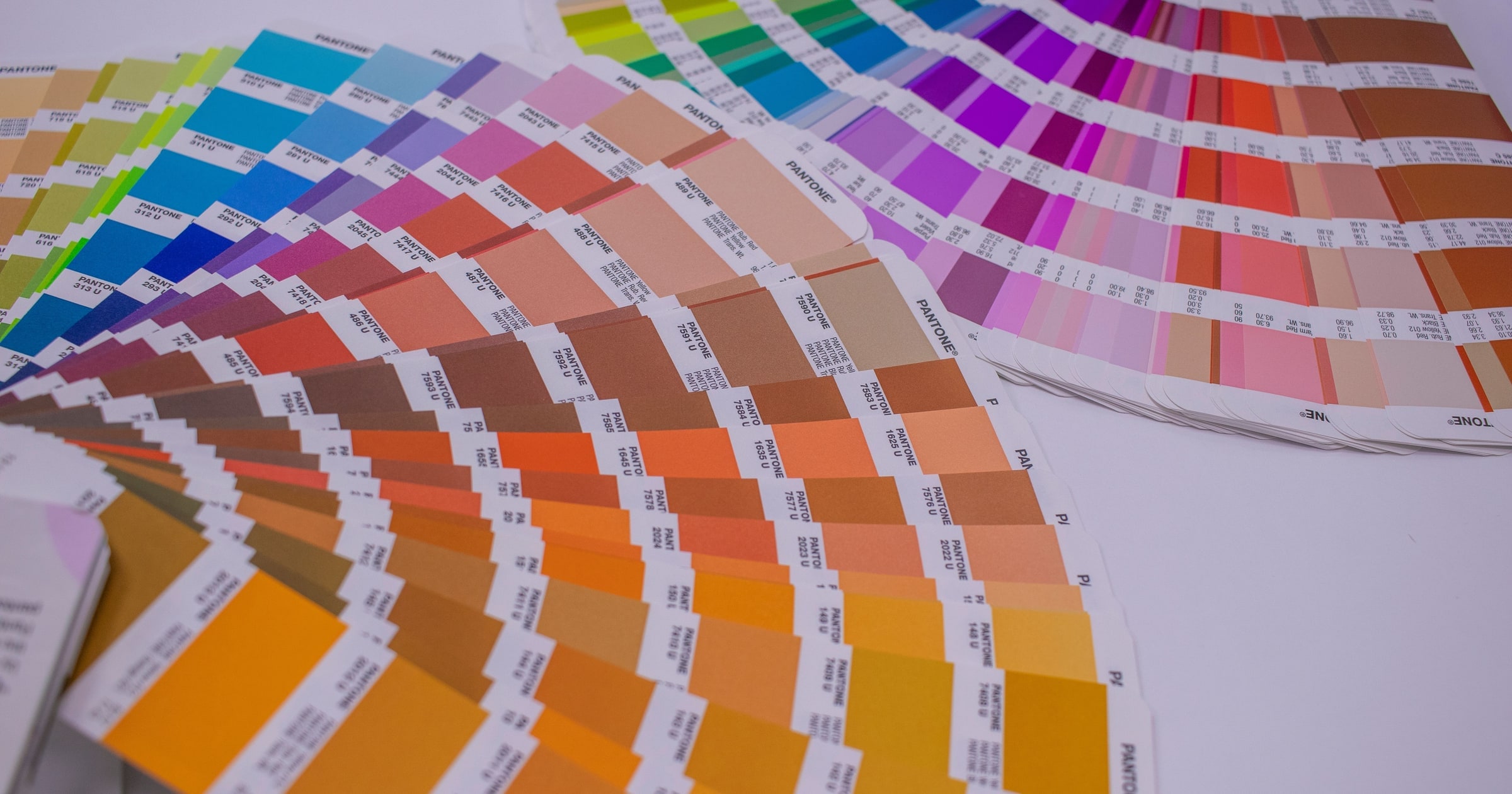
The print trade's reference is the Pantone Formula Guide. In Britain the set costs £220.80 with VAT and holds 2,390 colours on two fans of card. pantone-formula-guide Wada's book costs £19.50 from a British design bookseller. counter-print-wada Pantone sells colours one at a time, each numbered, so a printer in another country can mix the same ink.
Each December Pantone also names a Colour of the Year. For 2026 it is Cloud Dancer, PANTONE 11-4201, the first white since the programme began in 1999. pantone-coty-2026 woodworking-network-white-coty The dear authority tells you which colour, and this year it chose the one that says least alone. A white is nothing until something sits beside it. What to put beside it is the only thing the cheap book sells.
| Source | Price | What you get | Tells you what goes together |
|---|---|---|---|
| Pantone Formula Guide Set | £220.80 inc. VAT | 2,390 single colours | No |
| A Dictionary of Color Combinations | £19.50 | 348 combinations of 159 colours | Yes, chosen by one eye |
| Coolors | Free, with a paid tier | "10M+" palettes, by its own count | Yes, by rule or at random |
I should say where I stand. I am no expert in colour theory, and my own palettes are conservative: blues, neutral greys, black and white, chosen for accessibility. Colour has always fascinated me, and almost none of it reaches my own work.
Light mode, dark mode
A modern interface has to work in light mode and dark mode, and I always test a new palette against WCAG, the web's accessibility standard. wcag-contrast Its strictest grade, AAA, asks for a contrast ratio of 7 to 1 between text and background. The formula uses luminance alone. Hue does not enter it.
So I put Wada's 120 two-colour pairings through the same test. Only 13 reach AAA, and 28 reach the everyday AA grade of 4.5 to 1. He was dressing people and printing posters, and most of his pairs would fail as body text. Yet that beats chance, narrowly. Blind pairs from the colours he used most reach AAA about two-thirds as often. The screen's hardest rule and the painter's eye are measuring the same thing.
Through a wall
Through a party wall you lose the words first, then the tune. The beat still arrives, in the floor and in your chest. You could dance to it without knowing the song.
Light and dark are the beat of a pairing, and hue is the lyric. Most of Wada's pairs keep time.
Every good pair has contrast
Every good pair has contrast, and nobody needed a 1930s painter to learn it. Painters have a saying for it: value does the work and colour gets the credit. schneider-value-credit Coolors ships a contrast checker beside its generator. coolors-contrast By my own count, 107 of Wada's 120 pairs fail the strictest screen test. On this reading he found nothing. He had taste, and the raving is fashion in a tan cover with 492,000 views.
Most of that I accept. He discovered no law, and my numbers cannot measure taste. I have not run a generator's output through the same test, so I cannot say the tools do worse. But the checker sits apart from the generator, as a test you run after choosing. Wada chose by light and dark first, and I think that order is what people are responding to.
The bottom line
It isn't nostalgia. I have spent years choosing by light and dark and calling it caution. Wada chose the same way ninety years ago and called it colour.
¿Trabajamos juntos?
Consulta los planes, haz una pregunta o reserva una llamada.
Más sobre Diseño
Ver archivo

Mantente al día
Añade este enlace a tu lector RSS para recibir nuevos ensayos y actualizaciones automáticamente.