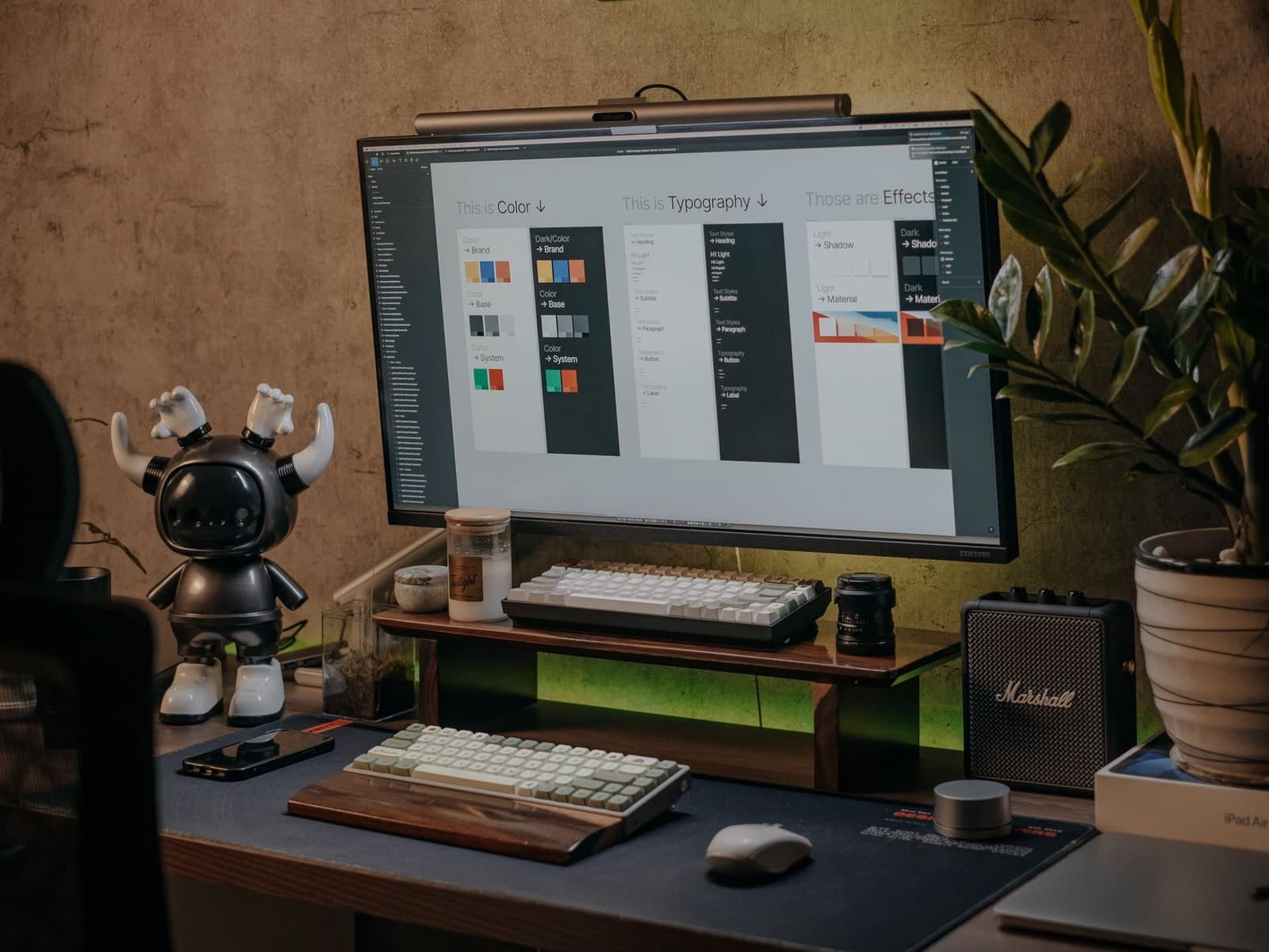
Theme
Source of truth: components.json with style: "radix-maia"
Last updated: 2026-02-27
Native Maia theme (enforced)
Use native shadcn Maia theme components only. Do not add custom style overrides that deviate from the theme.
- All UI components (Select, Button, Dialog, etc.) must come from the shadcn registry.
- No className overrides for radius, background, or border on shadcn primitives. If something looks wrong, fix the component file or theme, not the usage.
- Add or update components with:
Code
npx shadcn@latest add <component> --overwrite - Do not change
styleorbaseColorincomponents.jsonunless intentionally switching themes.
Design tokens
- Radius: Defined in
app/globals.cssvia@theme inlineand:root. - Muted (light mode):
--muted: oklch(0.92 0 0)— tuned for perceptible ghost-button hover contrast against--background(WCAG 2.1 non-text contrast). --radius: 1rem(large). Derived:--radius-smthrough--radius-4xl.- Use the same radius token for related elements (e.g. trigger and dropdown).
Spacing scale
Use a consistent spacing scale for padding, margins, and gaps:
| Pixels | Tailwind | Usage |
|---|---|---|
| 4 | p-1, gap-1 | Tight gaps, icon padding |
| 8 | p-2, gap-2 | Small gaps between related elements |
| 16 | p-4, gap-4 | Default padding, card gaps |
| 24 | p-6, gap-6 | Section spacing |
| 32 | p-8, gap-8 | Large section breaks |
Avoid arbitrary values unless aligning to a specific design spec.
Accessibility
- WCAG AA — Text contrast and non-text contrast (ghost buttons, borders).
- Focus states — All interactive elements have visible focus rings (
focus-visible:ring-2,focus-visible:ring-ring). - Semantic markup — Use
aria-label,aria-describedby,rolewhere appropriate. Prefer native elements (<button>,<a>) over divs. - Reduced motion — Respect
prefers-reduced-motionfor animations. Transitions should clarify state, not distract.
Motion (Framer Motion)
- Library: Framer Motion is available for declarative enter/exit, layout, and gesture-based animations.
- Import path: Use
@/lib/motion(re-exportsmotion,AnimatePresence, and types) so future reduced-motion or config changes stay centralized. - Reduced motion: When adding animated components, use the
useReducedMotionTransition()hook from@/lib/motionfor thetransitionprop so animations are disabled when the user prefers reduced motion. Seelib/hooks.tsforusePrefersReducedMotion(). - Guideline: Use motion to clarify state and hierarchy; avoid decorative or distracting animation.
Touch targets
- Minimum 44×44pt for interactive elements (buttons, links, form controls).
- Use
min-h-11(44px) orsize-11for touch-friendly buttons on mobile. - Ensure adequate spacing between tap targets to prevent mis-taps.
Dropdowns and popovers
- Corner radius: Dropdowns/popovers that attach to triggers must use the same corner radius as the trigger.
- Example: Select trigger uses
rounded-4xl(pill) → SelectContent usesrounded-4xl.
- Example: Select trigger uses
- Positioning: For attached dropdowns that should overlap the trigger (shadcn Maia style), use:
instead of a positive gap (e.g.Code
sideOffset={-4}sideOffset={8}).
UI alignment checklist
When aligning a component with a reference (screenshot or live example), verify before declaring done:
- Compared to reference screenshot or live example
- Trigger: radius, size, padding match
- Content: radius, position, overlap match
- Items: first/last/middle use context-aware radius (
first:rounded-t-*,last:rounded-b-*) - No conflicting transforms or offsets (check full styling chain)
- Docs updated only after verification
Component-specific notes
| Component | Trigger radius | Content radius | Item radius | sideOffset |
|---|---|---|---|---|
| Select | rounded-4xl | rounded-4xl | first:rounded-t-4xl last:rounded-b-4xl first:last:rounded-4xl | -4 |
| Switch | — | — | — | — |
| Table | — | — | first:rounded-l-lg last:rounded-r-lg (8px, on first/last cell per row) | — |
Switch: Use for boolean toggles (e.g. Ask voice settings: Voice mode, Wake word). Wrap in min-h-[44px] min-w-[44px] flex items-center justify-center when a larger touch target is needed. From shadcn registry; has built-in focus-visible ring.
Table row cells: First and last cells (th or td) in each row use rounded-l-lg / rounded-r-lg (8px) in default and hover states. Requires border-separate border-spacing-0 on the table for rounded corners to render correctly.


