Sobre míHistoriasNoticiasLabPreciosEvents
Pregúntale a GaganComenzar
  1. Lab
  2. Design System

Explorar

  • Inicio
  • Sobre mí
  • Historias
  • Noticias
  • Archivo
  • Events
  • Precios

Conectar

  • Preguntar
  • Reservar llamada
  • Enviar correo

Recursos

  • Documentación
  • Kit de medios
  • Notas de la versión
  • Lab
  • Mapa del sitio
  • Feed RSS

Legal

  • Privacidad
  • Términos de uso
Resumen del sitio para IA·Corpus completo para IA

© 2026 Gagan Malik. Todos los derechos reservados.

Privacidad|Términos de uso|Mapa del sitio

Design System lab by Gagan Malik — inspect radix-maia tokens, shadcn components, spacing, radius, typography, and Maia dropdown patterns in the browser.

En esta página

  • Color tokens
  • Radius scale
  • Spacing scale
  • Typography
  • Button
  • Badge
  • Form fields
  • Select
  • Switch
  • Tabs
  • Dialog
  • Card
  • Table
  • Toggle group
  • Attached dropdowns
  • Focus rings
  • Touch targets
  • Motion
  • Theme
  • Native Maia theme (enforced)
  • Design tokens
  • Spacing scale
  • Accessibility
  • Motion (Framer Motion)
  • Touch targets
  • Dropdowns and popovers
  • UI alignment checklist
  • Component-specific notes
  • UI Components
  • shadcn components
  • Custom components (in `components/ui`)
  • Page skeletons (`components/skeletons`)
  1. Lab
  2. My Personal Design System
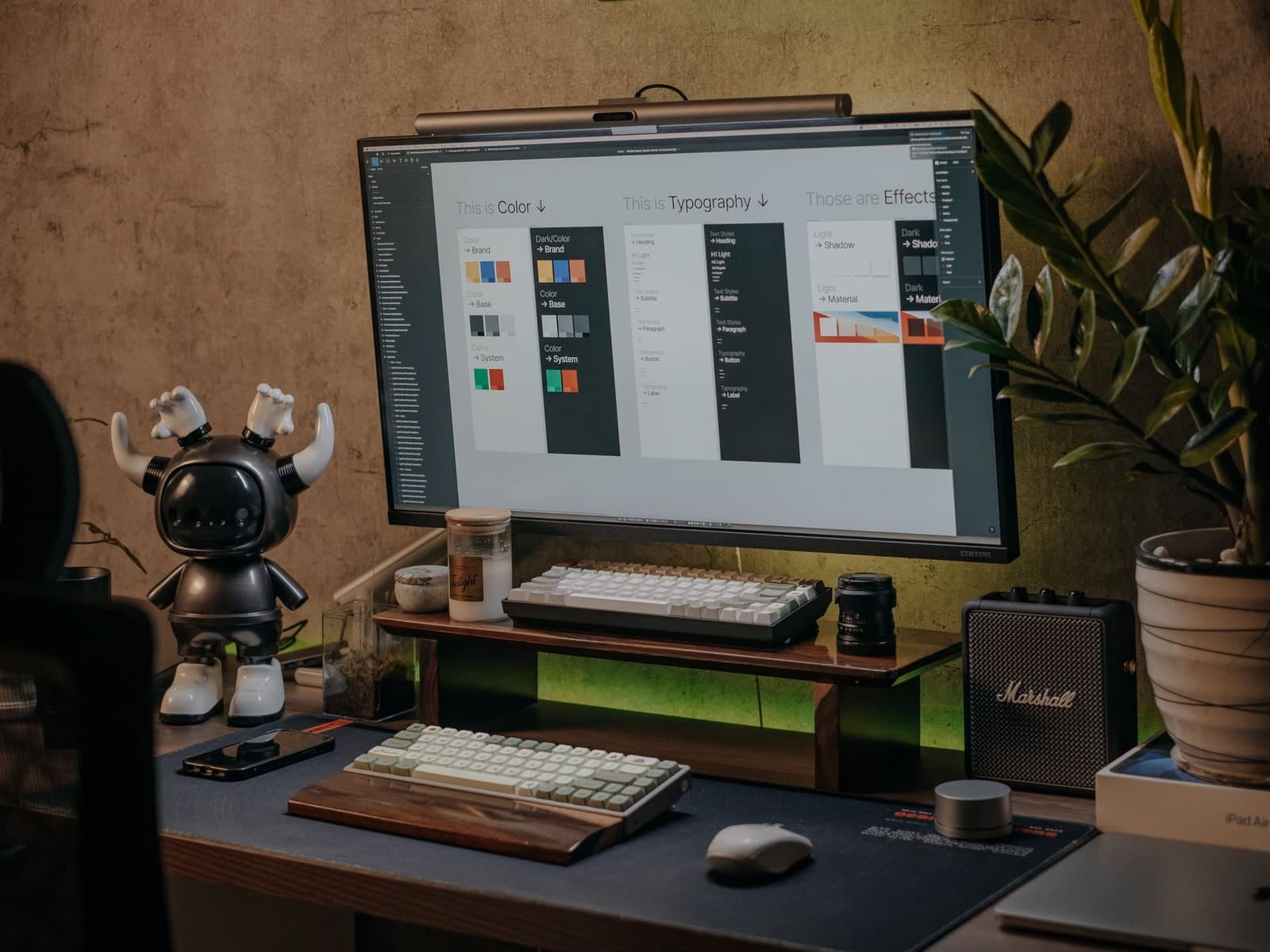
Cover image for My Personal Design System
Diseño21 de febrero de 2026

My Personal Design System

Por Gagan Malik

5 min de lectura

Color tokens

Semantic colors from app/globals.css — copy the CSS variable names into your theme.

Primary
--primary
Secondary
--secondary
Muted
--muted
Accent
--accent
Destructive
--destructive
Border
--border
Background
--background
Foreground
--foreground
Chart 1
--chart-1
Chart 2
--chart-2
Chart 3
--chart-3
Chart 4
--chart-4
Chart 5
--chart-5

Radius scale

Derived from --radius (1rem). Match trigger and dropdown radius in attached menus.

Small
rounded-sm
Medium
rounded-md
Large
rounded-lg
XL
rounded-xl
2XL
rounded-2xl
3XL
rounded-3xl
4XL
rounded-4xl

Spacing scale

Use 4, 8, 16, 24, and 32px for padding, gaps, and section rhythm.

4px — tight gaps

p-1 / gap-1

8px — related elements

p-2 / gap-2

16px — default padding

p-4 / gap-4

24px — section spacing

p-6 / gap-6

32px — large breaks

p-8 / gap-8

Typography

Inter loader tokens, type scale, and semantic foreground roles.

Inter

Primary UI and reading face — loaded via next/font/google on the root layout.

The quick brown fox jumps over the lazy dog. 0123456789

CSS variable on html

--font-inter

Tailwind @theme sans mapping

--font-sans: var(--font-inter)

Utility class

font-sans

Body smoothing

antialiased

Font loader

next/font/google · Inter

Subset and display

latin · display: swap

Heading 1 — page title scale

Heading 2 — section title

Heading 3 — subsection

Body — default reading text at text-base.

Muted — secondary copy at text-sm text-muted-foreground.

Small — captions and meta at text-xs.

Button

Variants and sizes from the shadcn registry — no custom radius overrides.

Badge

DefaultSecondaryOutline

Form fields

Field description using the Field pattern.

Select

Switch

Tabs

Tab panels clarify related content without leaving the page.

Dialog

Card

Card title
Grouped content with padding and rounded-xl container.

Use cards for self-contained summaries, not full-page layout.

Table

TokenTailwindUsage
--primarybg-primaryPrimary actions and emphasis
--radiusrounded-4xlPill triggers and attached dropdowns

Toggle group

Attached dropdowns

Dropdown content uses the same radius family as the trigger. Overlap with sideOffset={-4} for Maia attachment.

Focus rings

Tab to interactive elements — focus-visible:ring-2 on buttons, inputs, and switches.

Touch targets

Minimum 44×44pt for taps. Wrap compact controls when needed.

Motion

Animations respect prefers-reduced-motion via SectionReveal and shared motion helpers.

Theme

Source of truth: components.json with style: "radix-maia"
Last updated: 2026-02-27

Native Maia theme (enforced)

Use native shadcn Maia theme components only. Do not add custom style overrides that deviate from the theme.

  • All UI components (Select, Button, Dialog, etc.) must come from the shadcn registry.
  • No className overrides for radius, background, or border on shadcn primitives. If something looks wrong, fix the component file or theme, not the usage.
  • Add or update components with:
    Code
    npx shadcn@latest add <component> --overwrite
    
  • Do not change style or baseColor in components.json unless intentionally switching themes.

Design tokens

  • Radius: Defined in app/globals.css via @theme inline and :root.
  • Muted (light mode): --muted: oklch(0.92 0 0) — tuned for perceptible ghost-button hover contrast against --background (WCAG 2.1 non-text contrast).
  • --radius: 1rem (large). Derived: --radius-sm through --radius-4xl.
  • Use the same radius token for related elements (e.g. trigger and dropdown).

Spacing scale

Use a consistent spacing scale for padding, margins, and gaps:

PixelsTailwindUsage
4p-1, gap-1Tight gaps, icon padding
8p-2, gap-2Small gaps between related elements
16p-4, gap-4Default padding, card gaps
24p-6, gap-6Section spacing
32p-8, gap-8Large section breaks

Avoid arbitrary values unless aligning to a specific design spec.

Accessibility

  • WCAG AA — Text contrast and non-text contrast (ghost buttons, borders).
  • Focus states — All interactive elements have visible focus rings (focus-visible:ring-2, focus-visible:ring-ring).
  • Semantic markup — Use aria-label, aria-describedby, role where appropriate. Prefer native elements (<button>, <a>) over divs.
  • Reduced motion — Respect prefers-reduced-motion for animations. Transitions should clarify state, not distract.

Motion (Framer Motion)

  • Library: Framer Motion is available for declarative enter/exit, layout, and gesture-based animations.
  • Import path: Use @/lib/motion (re-exports motion, AnimatePresence, and types) so future reduced-motion or config changes stay centralized.
  • Reduced motion: When adding animated components, use the useReducedMotionTransition() hook from @/lib/motion for the transition prop so animations are disabled when the user prefers reduced motion. See lib/hooks.ts for usePrefersReducedMotion().
  • Guideline: Use motion to clarify state and hierarchy; avoid decorative or distracting animation.

Touch targets

  • Minimum 44×44pt for interactive elements (buttons, links, form controls).
  • Use min-h-11 (44px) or size-11 for touch-friendly buttons on mobile.
  • Ensure adequate spacing between tap targets to prevent mis-taps.

Dropdowns and popovers

  • Corner radius: Dropdowns/popovers that attach to triggers must use the same corner radius as the trigger.
    • Example: Select trigger uses rounded-4xl (pill) → SelectContent uses rounded-4xl.
  • Positioning: For attached dropdowns that should overlap the trigger (shadcn Maia style), use:
    Code
    sideOffset={-4}
    
    instead of a positive gap (e.g. sideOffset={8}).

UI alignment checklist

When aligning a component with a reference (screenshot or live example), verify before declaring done:

  • Compared to reference screenshot or live example
  • Trigger: radius, size, padding match
  • Content: radius, position, overlap match
  • Items: first/last/middle use context-aware radius (first:rounded-t-*, last:rounded-b-*)
  • No conflicting transforms or offsets (check full styling chain)
  • Docs updated only after verification

Component-specific notes

ComponentTrigger radiusContent radiusItem radiussideOffset
Selectrounded-4xlrounded-4xlfirst:rounded-t-4xl last:rounded-b-4xl first:last:rounded-4xl-4
Switch————
Table——first:rounded-l-lg last:rounded-r-lg (8px, on first/last cell per row)—

Switch: Use for boolean toggles (e.g. Ask voice settings: Voice mode, Wake word). Wrap in min-h-[44px] min-w-[44px] flex items-center justify-center when a larger touch target is needed. From shadcn registry; has built-in focus-visible ring.

Table row cells: First and last cells (th or td) in each row use rounded-l-lg / rounded-r-lg (8px) in default and hover states. Requires border-separate border-spacing-0 on the table for rounded corners to render correctly.

UI Components

Source: components/ui — shadcn registry (radix-maia theme)
Last updated: 2026-03-19

shadcn components

All components are from the shadcn registry unless noted. Add or update with:

Code
npx shadcn@latest add <component> --overwrite
ComponentFileDescription
Badgebadge.tsxStatus labels, tags
Breadcrumbbreadcrumb.tsxNavigation breadcrumbs
Buttonbutton.tsxPrimary actions, variants (default, outline, ghost, etc.)
Cardcard.tsxCard container with header, content, footer
Carouselcarousel.tsxImage/content carousel (embla-carousel)
Commandcommand.tsxCommand palette (⌘K)
Dialogdialog.tsxModal dialogs
Dropdown Menudropdown-menu.tsxContext menus, dropdown actions
Hover Cardhover-card.tsxHover-triggered popover
Inputinput.tsxText input field
Input Groupinput-group.tsxInput with addons (prefix/suffix)
Paginationpagination.tsxPage navigation
Popoverpopover.tsxFloating popover content
Selectselect.tsxDropdown select
Separatorseparator.tsxVisual divider
Sheetsheet.tsxSlide-out panel
Sidebarsidebar.tsxCollapsible sidebar layout
Skeletonskeleton.tsxLoading placeholder
Sonnersonner.tsxToast notifications
Switchswitch.tsxToggle (Voice mode, Wake word in Ask voice settings sheet)
Tabletable.tsxData tables
Textareatextarea.tsxMulti-line text input
Tooltiptooltip.tsxHover tooltips

Custom components (in components/ui)

ComponentFileDescription
Tracked Linktracked-link.tsxLink wrapper with analytics (trackEvent)

Page skeletons (components/skeletons)

Route-level loading UIs use shared skeleton components. They mirror mobile vs desktop layouts: tighter horizontal padding (px-4 → sm:px-6 / sm:px-8), primary CTA pairs stacked vertically with full-width controls on small viewports (flex-col → sm:flex-row), newsroom bento heroes with image on top and text block below on mobile (matching WritingsBentoCard), and section headers with title + “View archive” stacked on narrow screens. Inline skeletons in app/**/loading.tsx (e.g. pricing, archive, legal index) follow the same padding pattern.

For tech stack, SEO, and other technical reference, see full documentation.

¿Trabajamos juntos?

Consulta los planes, haz una pregunta o reserva una llamada.

Ver planesPregúntale a Gagan

More in Lab

View in archive

My family tree

15 de julio de 2026

Mantente al día

Añade este enlace a tu lector RSS para recibir nuevos ensayos y actualizaciones automáticamente.

Reservar llamada